NIGHT OWL CAFE
//
BRANDING
Night Owl Cafe is designed for students, creatives, and anyone looking to get meaningful work done during the late hours of the day.
With operating hours from 5 PM to 5 AM, the cafe serves as a place of refuge for those seeking a productive late-night environment.
2026
Graphic Design Program BCIT
NIGHT OWL CAFE
//
BRANDING
Night Owl Cafe is designed for students, creatives, and anyone looking to get meaningful work done during the late hours of the day.
With operating hours from 5 PM to 5 AM, the cafe serves as a place of refuge for those seeking a productive late-night environment.
2026
Graphic Design Program BCIT
The visual identity was designed around the idea of late-night productivity. Inspired by quiet study sessions, coffee culture, and after-hours creative work, the brand balances focus and comfort through a minimal visual system, muted colours, and approachable typography.
Different names were considered throughout the project, and "Night Owl Cafe" was selected because it aligned with the brand's core appeal.
The visual identity was designed around the idea of late-night productivity. Inspired by quiet study sessions, coffee culture, and after-hours creative work, the brand balances focus and comfort through a minimal visual system, muted colours, and approachable typography.
Different names were considered throughout the project, and "Night Owl Cafe" was selected because it aligned with the brand's core appeal.
In my initial logo sketches I tried out a handwritten wordmark but wanted to push the design further and make something that more clearly communicated what the brand represented.
This led me to incorporate the owl into the logo and explore the different ways it could be represented.
I eventually landed on the owl-with-headphones concept, as I felt it best represented quiet late-night study sessions.


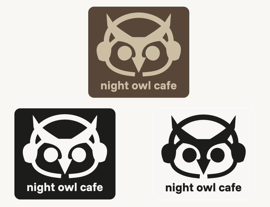
The logo maintains rounded corners for most of its design and a symmetrical design to create a calm, balanced, and welcoming identity.
Funnel Sans, a modern sans-serif typeface in a medium weight, was chosen for the wordmark because of its clarity and friendly tone, which is further emphasized by all lowercase.
The owl’s headphones reference studying and focus.
Beige and brown tones were chosen to create a calm atmosphere while reinforcing the cafe's focus on coffee and pastries.
The tagline "Coffee. Vibes. Deadlines." is simple and straightforward and communicates clearly what the cafe's identity is.
The logo maintains rounded corners for most of its design and a symmetrical design to create a calm, balanced, and welcoming identity.
Funnel Sans, a modern sans-serif typeface in a medium weight, was chosen for the wordmark because of its clarity and friendly tone, which is further emphasized by all lowercase.
The owl’s headphones reference studying and focus.
Beige and brown tones were chosen to create a calm atmosphere while reinforcing the cafe's focus on coffee and pastries.
The tagline "Coffee. Vibes. Deadlines." is simple and straightforward and communicates clearly what the cafe's identity is.

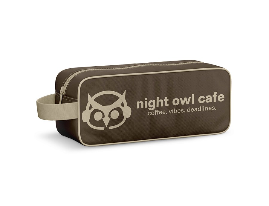
Exploration of how the Night Owl brand could expand into additional products and services through a unified identity system.

The business card applies the brand's colours and incorporates a subtle coffee-spill texture on the back and has a beige line at the bottom to make the design feel grounded.
The letterhead is simple as I could make it while still retaining the brand's identity. The goal was to ensure the design remained unobtrusive while keeping the content easy to read.
The business card applies the brand's colours and incorporates a subtle coffee-spill texture on the back and has a beige line at the bottom to make the design feel grounded.
The letterhead is simple as I could make it while still retaining the brand's identity. The goal was to ensure the design remained unobtrusive while keeping the content easy to read.


All products were designed with the target audience in mind, resulting in stylish, clean everyday lifestyle items that users can feel good about using.
All products were designed with the target audience in mind, resulting in stylish, clean everyday lifestyle items that users can feel good about using.