

//
BRANDING
Panel Tracker is a mobile app that provides comic and manga fans with an online space and community where they can log, rate, and share their thoughts on what they read.
2026
Graphic Design Program BCIT


Panel Tracker was created to make comic and manga tracking more organized, approachable, and community-driven.
With comics dating back to the late 1940s, there is a vast history and countless characters with decades of stories. All of this can be overwhelming and make it feel hard to know where to start or what to get into.
Choosing the Everyman archetype helped support the goal of making comics more accessible to a wider audience.
Research and mood board exploration led to the decision that community and accessibility would be a big part of the visual language and brand identity moving forward.

Once I had finished drawing the symbols and began brainstorming logo concepts, I noticed that the speech bubble was shaped like the letter "P".
I realized this would be a strong logo concept and would be immediately recognizable, so I developed a concept that incorporated the letter "T".


The final logo is friendly, full of youthful energy, and easy to understand.
Yellow and black were chosen as a nod to Batman, helping the brand stay consistent with its comic book focus.
A rounded typeface "Nunito'' was chosen to make the brand feel playful and approachable.
Track. Read. Connect. is our tagline as those 3 words encompass the main functions in the app.


The front of the business card uses the brand colours alongside a halftone dot texture inspired by classic comic books. This adds personality to the design while helping reinforce the brand's connection to comic and manga culture.
The back uses a reversed colour scheme to create contrast and distinguish it from the front.
The letterhead uses a minimal layout to keep the focus on the information being communicated. Subtle brand elements were incorporated to maintain consistency with the identity while ensuring the design remains clean, approachable, and easy to read.


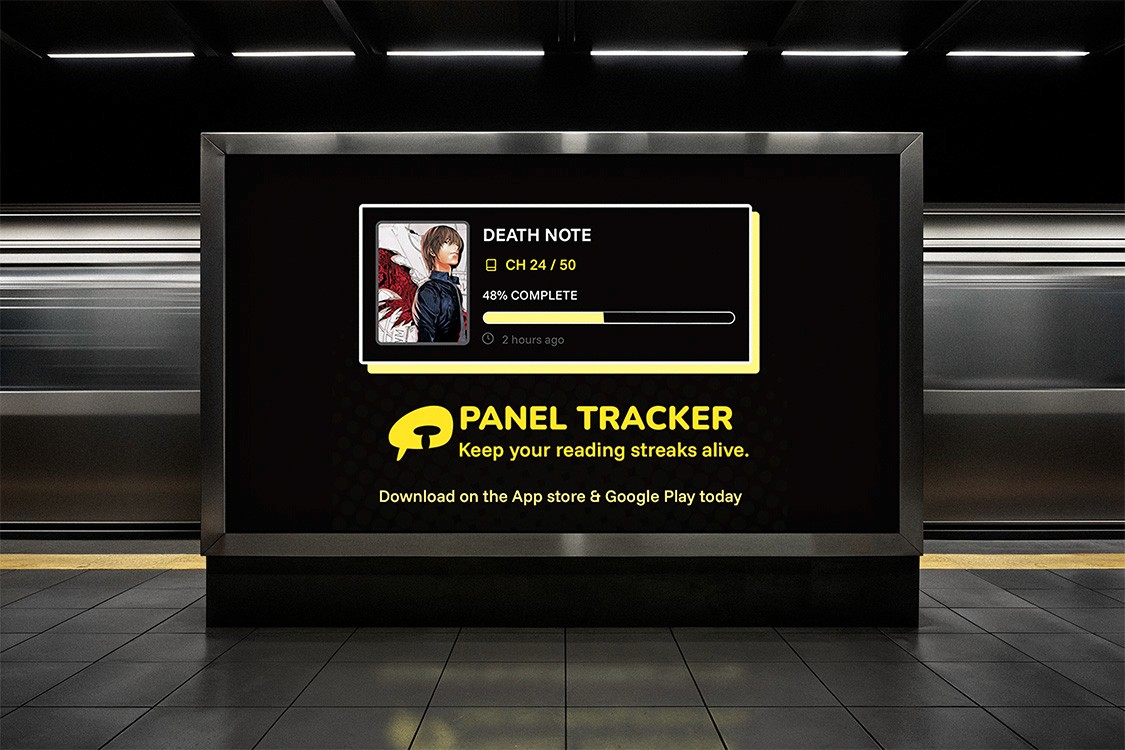
The digital banner ads target comic and manga readers by using bold visuals, energetic yellow accents, and relatable imagery that reflects real reading moments and app interactions.
Speech bubble shapes, halftone textures, and rounded typography reinforces the brand’s playful and enthusiastic archetype, positioning Panel Tracker as a fun and motivating companion for readers.
Each ad focuses on a clear stage of engagement, from introducing the app’s purpose to highlighting features and encouraging downloads, which supports a natural progression through awareness to retention.


