



I had ideas for the logo before sketching any symbols, so it was a quick and smooth transition into creating digital concepts.
The first concept was strong, but it felt too much like a sketch. I wanted to experiment with different variations and explore potential colour palettes.

I went with Concept #11, as I felt it was the most eye-catching design.
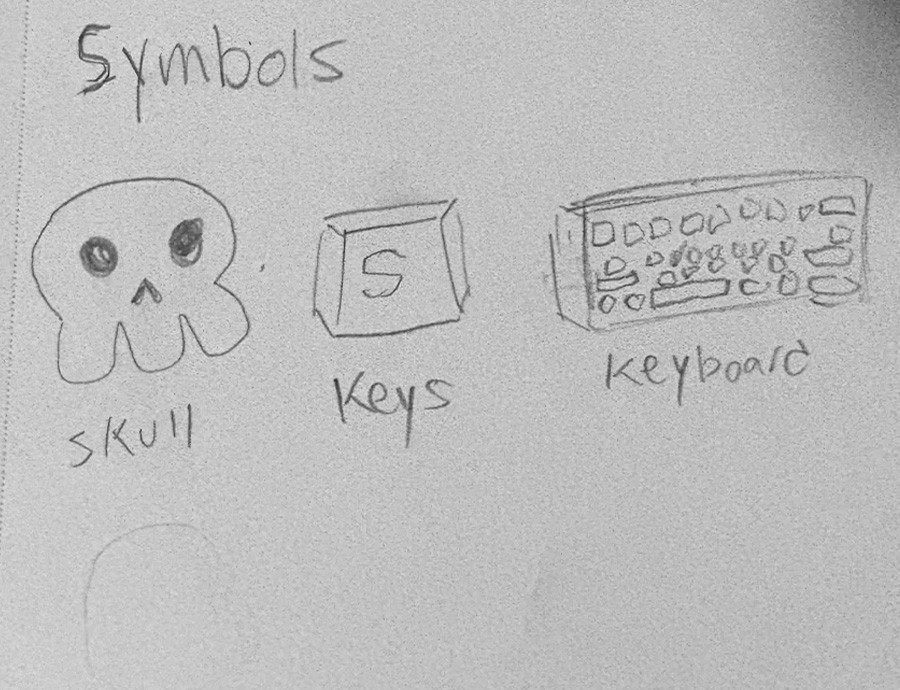
The skull's design is inspired by Día de los Muertos ("Day of the Dead") as well as the rubber-hose style seen in classic cartoons such as Steamboat Willie.
The bright green colour and lightning bolt communicate energy and appeal to gamers who enjoy fast-paced gameplay.
These elements were encapsulated within a rounded square to symbolize a keycap shape making the whole logo's design a keycap itself.
The "Super Warming" typeface was used for the wordmark, helping the overall design lean into that playful, cartoony look.

This poster was designed as a promotion for one of the keycap sets the brand sells.
The Hyper Lightning Edition was the keycap set chosen and has lightning coming off the keys, as well as a lightning pattern in the background to tie it together.
The poster guides the viewer smoothly from top to bottom, ending with the website and social media pages.
Brand colours and typography were used consistently to create a fun, energetic, and memorable feel throughout the poster.
