VIRAL DREAMS

//

BRANDING

Viral Dreams is a hyperpop music festival centred around digital culture, experimentation, and expressive creativity.


Inspired by the genre’s futuristic sound, emotional intensity, and internet-driven roots, a bold identity was created to reflect the energy and inclusivity of the hyperpop scene.

2026

Graphic Design Program BCIT

VIRAL DREAMS

//

BRANDING

Viral Dreams is a hyperpop music festival centred around digital culture, experimentation, and expressive creativity.


Inspired by the genre’s futuristic sound, emotional intensity, and internet-driven roots, a bold identity was created to reflect the energy and inclusivity of the hyperpop scene.

2025

Graphic Design Program BCIT

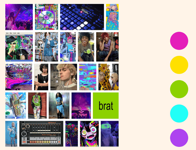
The visual direction was shaped by hyperpop’s chaotic, experimental nature and its strong connection to internet culture. Bright digital colours, futuristic forms, and expressive layouts were used to create an identity that feels energetic, immersive, and reflective of the genre’s audience.

The visual direction was shaped by hyperpop’s chaotic, experimental nature and its strong connection to internet culture. Bright digital colours, futuristic forms, and expressive layouts were used to create an identity that feels energetic, immersive, and reflective of the genre’s audience.

I took symbols commonly associated with the genre and transformed them into initial logo concepts.

The first design was inspired by a CD, leaning into the nostalgia of the late 90s and early 2000s. The second concept also drew from that same nostalgic era, using an old box TV paired with a Windows 95–inspired aesthetic. The third concept was based on the classic internet globe icon.

After exploring drafts for each direction, I found myself drawn to the TV concept initially, but realized it felt too bulky and lacked the versatility needed for a strong logo. The globe, on the other hand, better represented the festival’s digital identity and translated much more effectively as a clean, recognizable mark.


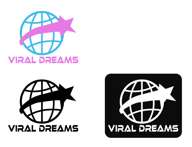
The globe was chosen as the primary logo concept because it best represents the festival’s focus on digital culture, global connectivity, and the rapid worldwide spread of viral content, reflecting hyperpop’s international online community.

A shooting star was also explored as a supporting symbol, representing ambition, rapid movement, and the futuristic, dreamlike energy of the festival.

The chosen blue and pink colour palette reinforces this identity, with blue symbolizing technology, trust, and digital connection, while pink adds creativity, playfulness, and the vibrant experimental energy associated with hyperpop.
This poster is inspired by retro-futuristic aesthetics. The vintage computer monitor evokes nostalgia for early digital culture while highlighting the event's modern and tech-forward themes.

The pixelated font, a playful cursor, and interactive elements like the QR code make the poster feel creative and techy, inviting the viewer into a digital dreamscape.

The organic shapes and bright colours juxtapose against the technical elements, speaking to the unfiltered creativity and originality of the featured artists. Overall, the poster’s design encapsulates the event's theme of meshing past and future, celebrating how music and culture are finding their way in an increasingly global, digitally empowered world

This poster is inspired by retro-futuristic aesthetics. The vintage computer monitor evokes nostalgia for early digital culture while highlighting the event's modern and tech-forward themes.The pixelated font, a playful cursor, and interactive elements like the QR code make the poster feel creative and techy, inviting the viewer into a digital dreamscape.The organic shapes and bright colours juxtapose against the technical elements, speaking to the unfiltered creativity and originality of the featured artists. Overall, the poster’s design encapsulates the event's theme of meshing past and future, celebrating how music and culture are finding their way in an increasingly global, digitally empowered world

The standard ticket was designed to be simple and minimal, aligning with what the package offered.

For the VIP ticket, I wanted to highlight the included meet-and-greet package while showcasing each artist on the ticket.

The standard ticket was designed to be simple and minimal, aligning with what the package offered.

For the VIP ticket, I wanted to highlight the included meet-and-greet package while showcasing each artist on the ticket.